I looked at a variety of different CV's including photography, Graphics and art CV's. All of them were different in their own way and you could clearly see by the theme or illustrations what line of industry they are in.
Photography CV
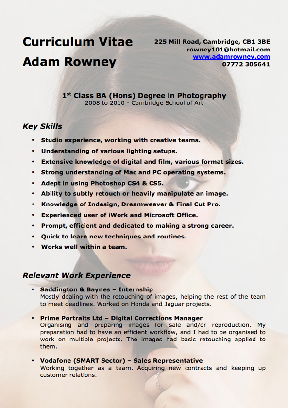
I don't like the image in the background, even though he has made it transparent I think it looks a little to hard to read the text on the CV. I also feel that there isn't many facts on the CV, he's just talking about his skills for most of it. I think his header need to be more bold to stand out, because when I first looked at this I completely overlooked it. I like the fact that he has included one of his photos, but I would like to see a photo of himself too.
Graphics CV

When I typed graphics CV into Google, there was a lot more bright and colourful Cv's that what there was of the photography CV's. Obviously graphics people have to show of their skills of design within their CV, but I found that some of them where a little bit too much in your face. This is why I like the CV above because it is simple and stuck to the same bright colours all the way throughout the CV. I really like the time line illustration, I think this is really interesting and engaging. I also love his theme, everything is neat and tidy and you don't have to read through everything to find one small bit of information.
Fine Art CV

I was surprised to see the art CV's weren't bright and colourful like the graphics ones were, although I do like the slanted look on this CV. I think it's a different take on the whole thing and will make someone pick it up because you don't see this very often. I do think it could use a little bit of colour, but everything else I really like about it. Its neat and easy to read, which is what is most important thing.
When I come to creating my CV, I will keep in mind to use simple colours and not have too many colours, I will also use illustrations and pictures to make it more engaging. I don't want mine to look to crowed so spacing and keeping it to the point is very important. As well as this, I want my name and contact details to be very noticeable and one of the first things you look at.
No comments:
Post a Comment